Tuesday 31 August 2010

Kitchen: tiling tales

Hurrah! The tiling is very nearly done apart from a bit of scrubbing needed to finish off. *big sigh of relief* I did the tiling all by myself. Yes, indeedy! I taught myself when we renovated the bathroom in our last flat.

The walls here made it difficult at times because they're not very even. Each tile needs a different amount of adhesive to bring the front of the tiles to a constant height. It took a lot of thought to get a good, even finish, with no gaps or oddly placed half tiles as the ends of rows, but I'm really, really pleased with the results, even though I say so myself!


I used cream grout between the tiles, rather than white, because, according to the tile shop, white tends to show the dirt and grease quickly in a kitchen, and discolours to dingy grey. Not nice.

I used wide spacers, rather than teeny narrow ones because the edges of the tiles are uneven. It gives them space to shine. ;-)


My top tiling tip is DON'T use adhesive and grout all in one, no matter what the adverts say. It's a TOTAL nightmare to clean off the tiles when you've finished. I was sucked in last time and so was dreading the cleaning part here but this lovely grout can almost be brushed off, which was a VERY pleasant surprise!


Our back doorstep used to be two badly fitted rectangles of mdf leaning against a makeshift cement step. SO not pretty. I asked our brilliant carpenter to make a proper wooden step for the back door and he came up with the fab idea of tiling it instead. Much more hardwearing, he said. Consequently, I have also been busy tiling that too....


So....it's now (or it will be when it's dried!) all covered up with smart charcoal grey slate tiles. Yummy. It was, indeed, an excellent idea so thank you, Mr Carpenter!


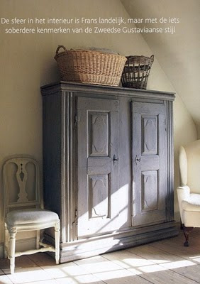
Now, on with fun part.....painting!

Enter your email address:

to subscribe to Modern Country Style


Monday 30 August 2010

Kitchen: a night on the tiles...

All systems are go in the kitchen. The blue and orange tiles have been removed. They came off very cleanly with a sharp knock of a hammer on the end of a scraper, which was prised behind each tile. We've painted over the orange walls in white to make it easier to see which areas need working on the most.


Sanding. Ugh. Mr Modern Country is in charge of the sanding. This is the only room in the house whose walls haven't been skimmed so there is a definite, shall we say, rustic feel to the room.


The search for the right tile was long and arduous but the mission is now complete! Did you know there must be a gazillion cream tiles out there? And that's a gazillion different shades of cream. I settled on one particular tile a few times and even went as far as lugging home a tile board from a shop in town, but I knew it wasn't 'The One' so kept on searching and, boy, am I glad I did.

I wanted a thick, chunky, dirty cream (i.e. not too pure a colour) 10cm by 10cm tile. I didn't mind whether or not they were handmade but I didn't want them to look regular and machine-made, with identically uneven edges. Don't you hate that?


I found an online tile shop that ship samples and ordered pretty much every one of their cream tiles! But the pain and anguish was worth it. I knew as soon it that it was The One: Caleidos in Cream. Divine! The perfect Modern Country Style tile!

We ordered 200 from Tiles of Stow, whose customer service was excellent. It's exactly what we wanted.....well, exactly what I wanted. Gorgeous Mr Modern Country thinks one cream tile looks much like the next.


The tiling has begun! We're only retiling around the sink and cooking area, rather than all the way along the tops of worktop, as it used to be. What about the bits that used to be covered by tiles? Well, now...... that's a surprise!

Enter your email address:

to subscribe to Modern Country Style


Saturday 28 August 2010

Kitchen: colour decision made....


....and the winner of the Kitchen final colour choice is:

Farrow and Ball's Blue Grey. Whooooooh! *raptuous applause*

My one slight concern is that the colour might be a tad strong all on it's own, so I think we will also be using Farrow and Ball's White Tie on one or two of the walls, yet to be decided. White Tie is officially described as: 'warm/neutral. The white of old, pre-brightened, starched cotton'. Good, useful information.


The Farrow and Ball description of Blue Grey is 'Try to view this colour in isolation from the others.' Uh? Eh? What?

I get what they're trying to say but a little extra information about the colour itself wouldn't go amiss. Yes, I hope you're listening, Mr and Mrs Farrow and Ball.


I'm talking to you. ;-)

Enter your email address:

to subscribe to Modern Country Style


Thursday 26 August 2010

Kitchen: Colour me beautiful....


I'm very excited to have new followers of Modern Country Style. Thank you! It's so lovely to know that I'm writing for people, rather than just sending it out in to the ether!

If you haven't signed up, and would like to then you just need to click on the Follow button to the right in the sidebar. And please know that I really and truly appreciate it.

Anyway, pressing on with the kitchen. Once I'd done my taking stock (not at all the same as a stock-take!) of the room, the next stage was colour choice. My favourite, bestest, most enjoyable bit in the whole world ever! I could look at paint colours all day every day. Mmmmmmm. Mr Modern Country is completely confounded by this pastime. If I've heard 'Oh, you're looking at colour charts.... again' once, I've heard it a thousand times!


So how do I choose a colour for a room? Well, my first step is always to look through as many colour charts as possible, waiting for particular shades to jump out at me. Not because they're garish but just because I love them. The kitchen is a North-West facing room that doesn't get masses of light, especially in the winter so the colour can't be too cool.

When I've narrowed the choice down slightly....

I buy sample pots........

and paint them onto A3 bits of paper.

I then hold these up in different places in the room and at different times of day and night to get a feel for how they react to different moods. Those photos are of almost all of my sample pots, by the way, not just the ones I've bought for the kitchen. There are a lot, I know, but I find that if you rely on the paint chips on the charts then, especially with the more expensive brands, you can't get a good understanding of how the paint will look on a larger scale.

By this time, I've usually narrowed it down to two or three. I've taken some shots of different pieces of paper held up against one of the kitchen cupboards. It looks bizarrely like I've actually painted the room in each of the colours in the photos but, rest assured, I didn't take my crazy colour obsession that far! So, here goes....

Farrow and Ball Ball Green:

Farrow and Ball Blue Grey:

Paint and Paper Company Eucalyptus:

My vote's with the Blue Grey. Which do you like? Watch this space!

Enter your email address:

to subscribe to Modern Country Style


Wednesday 25 August 2010

Sitting in the garden...


We're starting to get a second flush of roses in our garden. The garden seems to be rushing headlong towards Autumn so it's particularly welcome as a quiet reminder of the warmer days of high summer.


I like wandering in our garden. I try to do it every day, rain or shine, to make sure I am savouring all that it has to offer me. Admittedly, at times, it's nothing more than a quick mooch in the middle of getting the washing in, but my favourite times are when the children are at school and I can sit alone on the garden swing, with only the smallest glimpse of our house, and be still and pray and think and watch. That doesn't sound very still, does it, but it feels still to me, compared with normal daily life!

When I was out yesterday, this beautiful creamy specimen caught my eye. It only gets two flushes a year, rather than flowering continually as I'd really prefer, but they are so sumptuously full and fragrant when they flower that it makes any quiet spells worthwhile.


The colour is perfection. Creamy calico on the fronts of the petals and the warmth of freshly whipped double cream on the backs, which means that, as the petals fold in on themselves towards the centre, the colour reflects and intensifies and becomes almost pale gold. Heavenly.

Enter your email address:

to subscribe to Modern Country Style


Tuesday 24 August 2010

Before: Kitchen lists....


These are from when we looked around the house before we bought it so they're not our things in the pictures.

Today I want to focus on what I DO like about the room.

Here's my 'like' list:

the units, which are cream and shaker-style - they were put in by the previous owners just before we moved in and luckily are pretty much what I would choose in that price range;
the tap;
the lino flooring is neutral and very practical (good for four young children dropping china!) and easy to clean;
the pale wooden window frames;
the lighting - there's a main light and two spotlights;
the number of cupboards is great for storage;
the layout works excellently;
the beech worktops - when we first moved in I was worried about marking them but if you do, you just sand the mark away as if by magic! Plus I LOVE the smell of the danish oil, which is a bonus.

What I want to change:

the boiler in the corner - so ugly, so noisy;
the wall colour - too orange;
the tiles - too garish;
the wood stain on the back door - too dark, too orange;
the faux wood kick-boards - they visually break up the pale cupboards and flooring too much.

We did look at getting the dividing wall moved but the builders seemed unsure how big a job it would be. There is an RSJ in there, although there's no walls above it to support. We were all very confused and I was keen for this room to be a makeover, rather than a complete overhaul, which meant avoiding potentially structural work. When the actual kitchen units themselves need replacing then we'll tackle the whole room head on.

Enter your email address:

to subscribe to Modern Country Style


Monday 23 August 2010

Rat tail cutlery


Having young children is a major hazard of my Modern Country world.

That's not to say that I don't utterly adore them but I have three words for you: silver, cutlery and bin.

Yes, I did cry.


When Mr Modern Country and I got married, we were given a set of beautiful silver-plated rat tail cutlery. The 'rat tail' refers to the raised line that is on the back of the heads of the spoons and forks.

I know some people save their best cutlery for...ummm...best. Call me a fool, if you will, but I've always wanted to use ours everyday.


When I was young, my parents had a cabinet full of their best things that never got used (or never when I was around anyway!!) and I always vowed that when I was a grown -up, I'd always keep my loveliest possessions in constant use, for better or worse!

Fast forward eleven years, four children later, and my romantic notions have come back to haunt me!

Our youngest two, who are twins, have, as their house job, the lovely task of clearing the table after tea. They are overseen by yours truly but the job is basically theirs to do. However, I have noticed, since they started this chore, that some of our lovely silver-plated rat tail cutlery has gone missing. Hmmmm. I think they went the way of empty yogurt pots and leftovers. In the bin! Aaaargh! I hope the refuse collectors were pleased!


So, that's the sad news! The happy news is that I've found a fabulous replacement source. Last week, I ordered lots more (remember we have added four extra people to our family since we were given the originals). I'm so, so pleased with them! They are shiny and lovely and beautiful.

And the best part is that they were so much cheaper than our originals because they were from an antiques shop, rather than John Lewis. I was starting to wonder if I was being a bit foolish allowing the children to handle such expensive things everyday, if those things were going to go the way of the others (goodbye Mr Serving Spoon....) but this is a perfect, perfect solution. Hurrah!

Enter your email address:

to subscribe to Modern Country Style


Friday 20 August 2010

Vintage postcards....

Thank you to my lovely new followers! If you'd like to follow Modern Country Style, the super-shiny brand new 'Follow' button is on the sidebar to your right. See it? It just needs a teeny click and you're there!


When I was a little girl, an old lady I used to visit once a week called Mrs Exeter gave me a pile of old letters and postcards. At the time, I thought it was rather a boring present (yes, I am ashamed I ever thought such a thing...) but now I love them! They're not just any old postcards. They are correspondence from 1930s England between my friend and her godson Gordon.

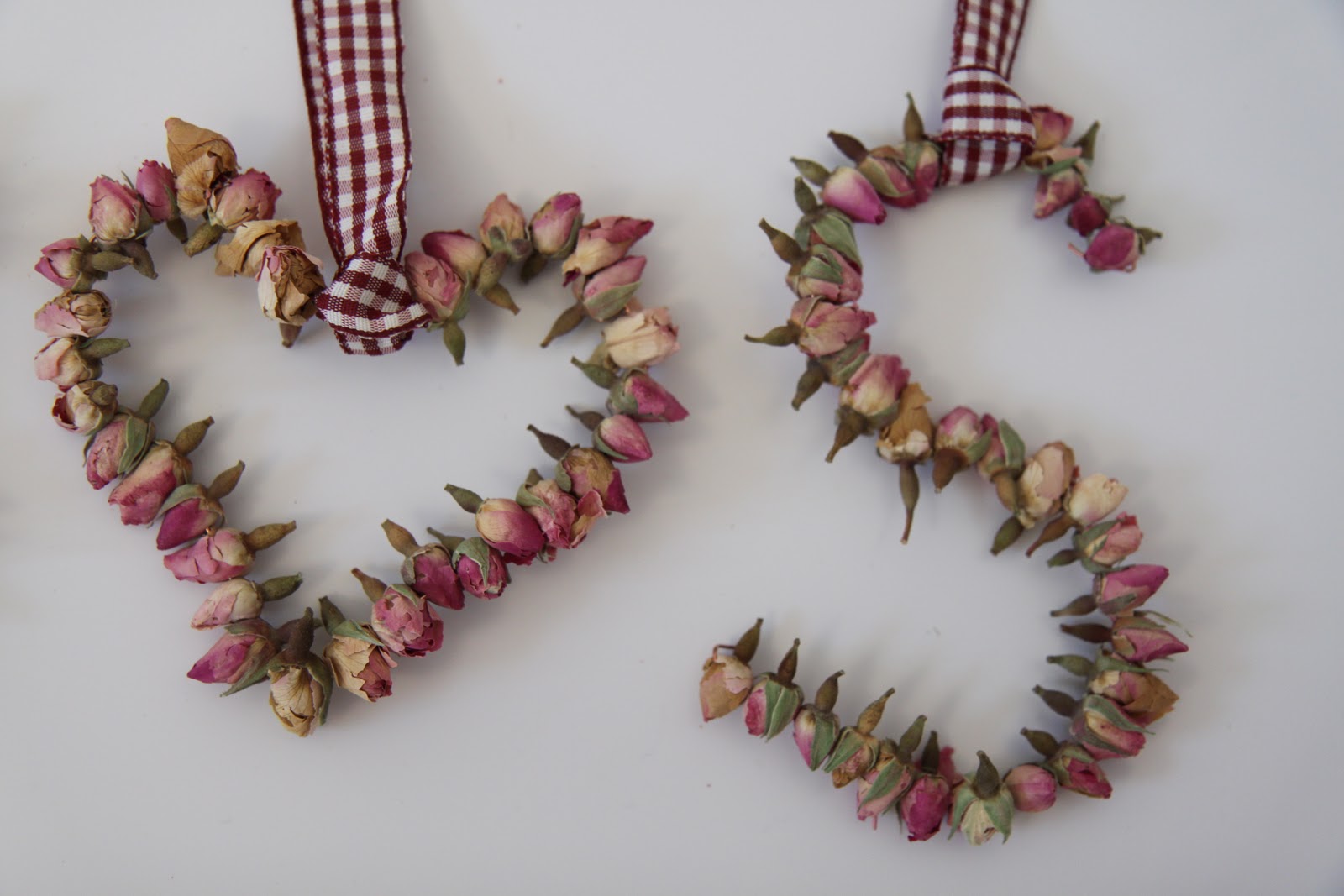
They've been sitting around stored away and I had all but forgotten about them in the hustle and bustle of every day life. Then last week, they suddenly popped into to my mind and set me a-wondering what I could do with them. It seemed such a shame to just have them stashed away. I wanted them, or at least some of them, to be on display. But how to do it?

I found two picture frames that I really loved. I'd bought them a while ago but hadn't yet used them. Do you buy the frames before you've decided how to use them or buy as you need them?


I find if I buy when I need them then I can't always find what I'm looking for. So, if I see a picture frame I particularly like then I often buy it and look out for how I can use it. I will, of course, have to stop this frame-buying fetish sooner or later, otherwise our house will be filled top-to-botttom with picture frames!


They're slightly distressed off-white wooden frames. One is slightly larger than the other, which I like. Adding interest and all that.

I picked out two letters that I liked the colours of especially (no orange stamps for me!!!).


One has a lovely old red stamp and slightly yellowed paper. Aaaah! So gorgeous. Really and truly vintage.


The other is the envelope from a letter in a gorgeous grey-green-blue colour (as you will know, my favourite ever colour, in its many guises).

Then it was just a matter of popping them in the frames. The envelope did need trimming slightlyto fit, which I feel terribly guilty about. But, I decided it was better to be cut and out, than hidden away in a box, so I got scissor-happy....


And putting them out on our console table in our living room, which was looking a little bare.

I'm so pleased with this project! What do you think? Do you like them?
What would you have done with a box of old letters? Ideas on a postcard!! (hoho)....or, much easier, you can leave a comment below....


Well, it's Friday again, which means a lovely weekend ahead! I hope you have a smashing time, whatever you do, enjoying the last of the summer days.

Enter your email address:

to subscribe to Modern Country Style


Wednesday 18 August 2010

Modern Country Style blog love: Room Seventeen

I've just stumbled on a new blog - well, new to me anyway - and it's perfection! You know how it is when you see blog link after blog link and then one of them REALLY leaps out at you. That was this one for me. It's called Room Seventeen.


It's a Dutch blog but thanks to the wonders of Mr Google, it can be translated reasonably well in a twinkling of an eye. Magic, isn't it. I could just stare at these photos all day, couldn't you? The colours (or lack of!!), the texture, the way the rooms are styled. Ooooooh!


I love the branches in the rough urn and the dark, brooding walls, contrasting with the cosy armchair, complete with cushion. Who wouldn't want to sit there and pass the afternoon away reading by the light of the lamp?

Room Seventeen has a mixture of inspirational posts and privileged peeks into the author's life and home. My favourite kind of blog. There's not too little inspirational material that it feels like a diary and not too little 'real life' posts that it feels impersonal.


The content is generally plain, elegant and simple. All in a good way. In fact, 'plain and simple' probably undersells the care and attention to detail in these photos. Beautifully put together, they encompass all that's lovely about Modern Country Style.


Chrome lamps with wicker shades. How original is that? Complete clash of old and new. And pulled off so stylishly.


Thank you so much for stopping by at Modern Country Style. Please have a good snoop around and don't forget to let me know what you think!!

Thank you for all the lovely comments recently. Can you hear my heart skip?!

Enter your email address:

to subscribe to Modern Country Style


Tuesday 17 August 2010

Book review: At Home with Country by Christian Strutt

Yes, another post on Cabbages and Roses! I was so inspired by my own blog that I popped over to Amazon, my second home, and got all spendy!


Christina Strutt, founder of Cabbages and Rose, was, once upon a time, assistant Vogue Living editor. She certainly knows what's what when it comes to styling.

Her fifth book, At Home With Country: Bringing the Comforts of Country Home arrived this morning and I am simply bursting to share it with you!


Something that really made me smile (and hop around and tell Mr Modern Country, who was most bemused!) is that the photo that I called 'genius' in my last Cabbages and Roses post, is the title picture for the chapter called 'Modern Country'! Isn't that the coolest coincidence?! Don't you love it when that happens?


One of the aims of the book is to show that the Cabbages and Roses style needn't be reserved for the classic traditional country home but can be applied, with thought, to enhance almost any look. However, it's the Modern Country Style pictures that most draw me in (this is a Modern Country Style blog, after all!).


Each chapter (Classic Country,Modern Country, Island Country and outdoor Country) contains homes that Christina has styled using her Cabbages and Roses magic. Totally gorgeous without exception.


The Modern Country chapter is, of course, especially totally gorgeous but all the sections contain stunning styling that gets you into Christina's mindset: these are fabrics that can add beauty to any setting.

Enter your email address:

to subscribe to Modern Country Style


Related Posts with Thumbnails
 
01 09 10